Context & ownership
Make a complex product feel like one place.
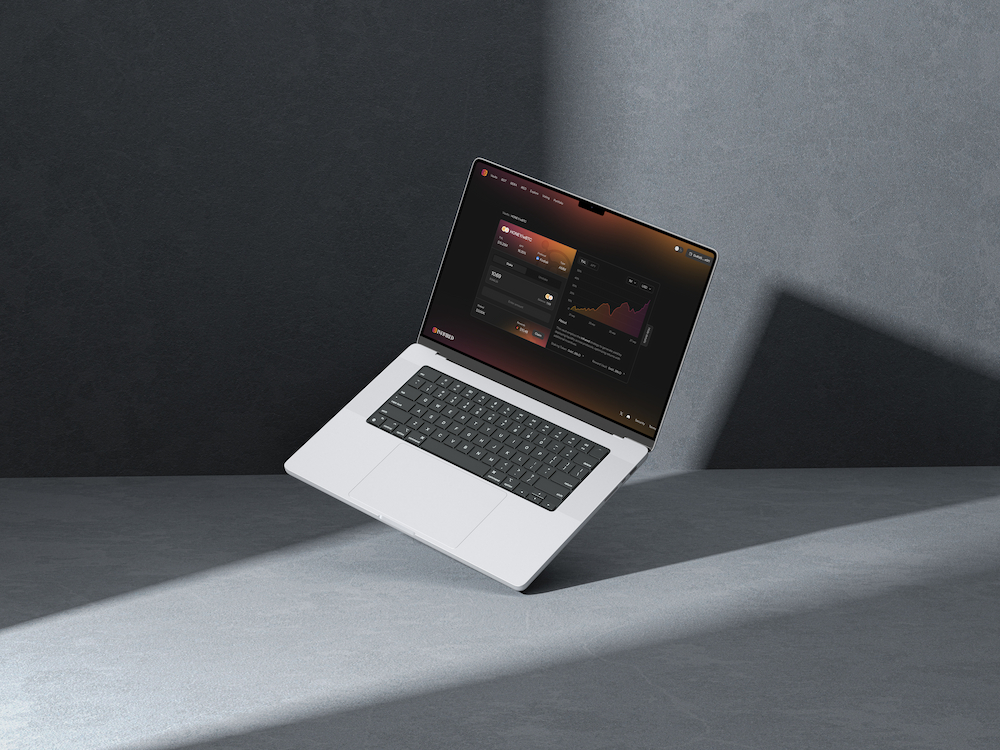
Infrared’s product designs connect vaults, staking, rewards and portfolio information. A person needs to understand what they hold, what they can stake and where rewards appear, while navigating a wider product ecosystem.
The visual identity needed enough character for the brand while leaving room for dense financial controls, status feedback and responsive layouts.
Role & scope
My role
Individual contributor responsible for identity, visual direction and interface design within a freelance engagement.
Product scope
Initial staking and vault interfaces, responsive layouts, portfolio views and the components supporting those screens.
Brand applications
Identity guidelines, marketing direction and website design, connecting the product with its wider introduction.
Design decisions
Identity
Use the thermal idea across the brand.
The symbol and serif wordmark establish the identity. Orange and magenta treatments turn the thermal idea into a visual motif that can also appear in backgrounds and product illustrations.
Instrument Sans gives the interface a different role from the wordmark. Controls and information remain direct, while the surrounding brand carries more of the visual expression.
A thermal symbol and serif wordmark form the core of Infrared’s identity.
Instrument Sans provides the interface typeface alongside the more expressive identity.
Staking workspace
Keep the action beside the position it affects.
The iBGT workspace groups amount entry and balance with the existing stake and claimable rewards. Performance and token details remain available beside the action.
The vault layouts follow the same approach. On mobile, the content stacks into a single column while preserving staking controls, rewards, the performance chart and the supporting explanation.
Amount entry, existing stake and claimable rewards share a workspace with performance and token details.
The same vault content adapts into a single mobile column.
Portfolio
Show the holdings and the gaps in the same view.
The portfolio design combines aggregate performance with reward information and individual positions. Products without holdings receive explicit empty states, keeping the account view understandable across a mixed set of balances.
The portfolio brings positions and rewards together, while giving unowned products explicit empty states.
Design system
Specify the states behind the visual style.
The button family turns the visual direction into reusable rules for action hierarchy, interaction states and size.
The button family specifies hierarchy, size and interaction states, including focus and disabled treatments.
Action hierarchy
Primary, secondary and tertiary treatments distinguish the main action from supporting controls.
Interaction coverage
Focus and disabled states sit alongside pointer interaction states in the specification.
Size and composition
Size variants let the same action language work in both focused forms and denser product layouts.
Brand applications
Extend the product language into the website.
The marketing website uses thermal lighting and dimensional vault imagery to introduce the product. Its ecosystem sections connect the broader proposition with the individual staking and vault destinations.
The marketing website carries the thermal visual direction into product discovery and explanation. Enlarge to see the full page.
Outcome & reflection
Brand and product, built as a connected system.
The work spans identity, reusable components, responsive product layouts and marketing applications. Together, those artifacts show my contribution across the full design process, from visual direction to the controls and states inside the product.
The strongest brand detail is one that still works when the screen fills with real controls and information.