Context & ownership
Give the investment experience a recognizable voice.
Delphia’s consumer investment experience needed an identity that could work in an ad, on a website and inside an account. The design file brings those surfaces together, from the monogram and type choices to onboarding and portfolio screens.
The expressive brand needed to hold up around precise financial information, account creation and investment comparisons.
Role & scope
My role
Individual contributor responsible for branding, visual direction and UX/UI within a freelance engagement.
Product scope
Initial onboarding and investment screens, including account entry, a growth projection and portfolio presentation.
Brand applications
Visual guidelines, the marketing website and advertising creative connecting the identity with the product.
Design decisions
Visual direction
Connect the identity with its applications.
The identity pairs a geometric monogram with navy, gold and cream. The mark works on plain and textured surfaces, while the marketing ad brings those colors into a composition with a headline, phone and investment chart.
These applications show how the identity behaves beyond the logo: texture creates depth around the product, and cream text and surfaces keep the message readable.
The geometric identity carries across light, dark and textured applications.
A marketing application brings the visual identity and product demonstration into the same frame.
Onboarding
Move from introduction to something the user can explore.
The opening screen carries the identity into account creation, with the value proposition above the sign-up choices. The visual treatment remains recognizable even at the scale of a phone.
The projection screen changes the emphasis. A starting-capital slider sits beside the comparison chart, with the selected amount and time horizon visible. The screen gives the user a concrete model to explore before continuing.
A distinctive visual identity carried into iOS onboarding.
An interactive projection makes investment inputs and comparison visible.
Marketing website
Keep the product and its introduction visually connected.
The investment-strategy section brings the identity into a complete product explanation. An isometric illustration connects the steps with geometric paths, data symbols and the eye motif, using the same lavender, gold and dark outlines as the wider visual system.
The portfolio illustration reuses that vocabulary in a different composition: binary data, a balancing lever and a pointing hand. Together, the sections show how the visual system supports explanatory content across the marketing website.
The website’s investment-strategy section combines the visual identity with an illustrated explanation of the product proposition.
The portfolio illustration carries the eye, hand and data motifs onto a purple background.
Visual system
Give expression a repeatable structure.
The visual guidelines define the typography and identity applications behind the screens. Those rules make it possible to move between expressive brand moments and information-heavy product views.
Brand applications
Carry the visual rules through the website.
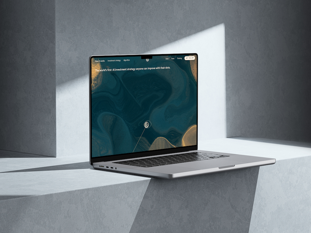
The full website brings the product introduction, illustrated explanations and mobile interface into one continuous page. Repeated type, color and geometric framing keep those sections connected.
The marketing website extends the identity into a longer product story. Enlarge to explore the full page.
Outcome & reflection
A connected identity across brand and product.
The engagement brought branding, visual guidelines, initial product UX/UI and marketing applications into one body of work. The selected designs show the identity moving from a mark into onboarding, investment information and product communication.
A visual identity earns its place in a product when it can support the quiet, practical screens as well as the first impression.